

Inserts are an interesting topic in the Hobby - they can be highly sought after or completely ignored depending on the product, rarity, or value. Even if inserts are rare, they still have to look good for the Hobby to be into it. And not everyone will agree that an insert looks great even if the general consensus is a fan of it.
In recent times, Panini has been the king of the insert. Kaboom. Color Blast. Downtown. Topps has been trying everything in their power to recreate that with their flagship products - Helix, All Aces/Kings, Hidden Gems, Home Field Advantage (HFA), etc. If you ask me what my favorite baseball insert is, however, it’s none of these, and it may surprise most of you. Well, it will likely surprise those that don’t frequent the Baseball Card channel in the Prospects Live discord.
That insert isn’t from Topps or Panini, or any of the other North American card manufacturer.
My favorite insert year after year is the Cross insert from BBM, made for the Nippon Professional Baseball (NPB) league in Japan. The first year BBM created the Cross insert was in 2010, and we’ve had a Cross insert produced by BBM every year since. It started with the four elements as the theme, beginning with the Cross Stream card in 2010 (representing the element of water). The next three years we get Cross Blast (earth), Cross Blaze (fire), and Cross Wind (air) to complete the run of the four elements.
After that, it seems like BBM needed a second to figure out their approach to the Cross insert series. The 2014 version was the one and only version with the naming convention flipped, using the “Cross” term at the backend rather than the frontend (Cosmic Cross), and not packing it out into the BBM Flagship products (Version 1 and Version 2, similar to Series1/Series 2 type of setup), but only making it available within Sports Card Magazines (SCM). Think along the lines of the SI for Kids perforated cards made by Sports Illustrated magazines (but not perforated for SCM).
2015 re-introduced the Cross set to the BBM Flagship product as a normal insert, and back with the familiar pattern of “Cross” + the theme name for the year. According to NPB Card Guy, the majority of the inserts have parallel versions as well as autographed versions - both foil/facsimile signed and true signatures. Being based in the U.S. and unable to purchase through Japanese online auction marketplaces like local Mercari sites, I’ve rarely seen these types of parallels and autos available on eBay. But, that being said, I do own some parallels and autos (foil and true signatures) that I have come across for acceptable prices, primarily from my favorite all-time Cross insert. What Cross insert is that, you ask? Well, let’s find out!
And what I mean by that is let’s have some fun and do what we do best at Prospects Live - rank all of the Cross inserts.
16. Cross Blast (2011) - 35 OFP
Part of the original four elements, representing earth, and the second ever Cross insert. Short-printed and not part of the BBM flagship releases that year, these were part of team sets and treated like a parallel, with just 50 available per player that were given one. The only Cross insert I don’t own because they are too expensive for my tastes given their rarity, but maybe one day I come across a cheap example to add to my collection. It’s my least favorite at the moment, and I’ll admit part of that may be due to the fact I don’t have one in my collection. The Cross Blast word is so hard to read, and while I like the blue coloring in the top half, the dirt half is less pleasing. The dirt spraying everywhere just looks messy. I reserve the right to push this one up the rankings once I have one in my collection and can view it in the first person.
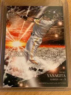
15. Cross Sunrise (2019) - 35 OFP
Normally you would consider a sunrise a beautiful thing. This card is far from it. I get the idea - it’s all dark, you’ve got a view above the clouds from a mountain top with the clouds below, and you see the sun light up the sky. Sounds great! But instead you get a black and white color palette with some red and orange hues coming from the horizon line. The cards feel so flat, and I was disappointed when I first ended up acquiring some. I think a sunrise over the ocean rather than clouds would have worked better, or just shifting the sky from being black dominant in the sky to more blue dominant. They went too literal for my tastes.
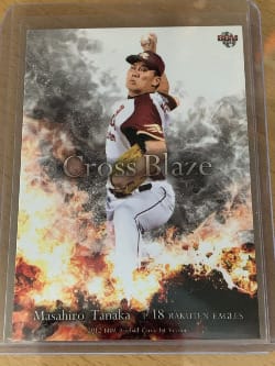
14. Cross Blaze (2012) - 40 OFP
I’ve gone back and forth on this one a bit, and I feel like in my teens and twenties, I would have been much more into this design. I’m guessing I would have been doing the Beavis impersonation and just moronically repeating “Fire! Fire!” when looking at the card. It’s more of a me problem at this point, but since I live in an area of the country that has five seasons - Spring, Summer, Fall, Winter, and Fire season, I see how realistic this card displays fire and smoke and can’t help but have a negative reaction. Which is why I say I’ve gone back and forth on this one - the realism in the art is strong and it should get points for that. If you don’t have that same association like I do, I can see really being into this design. It is a bit off with the color palette of whites, blacks, and grays not providing much balance to the violent flame yellow. I think for most people, this gets up into the 45 or even 50 tier, but in my ranks, I’ve dinged it pretty hard for emotional rather than logical reasons.
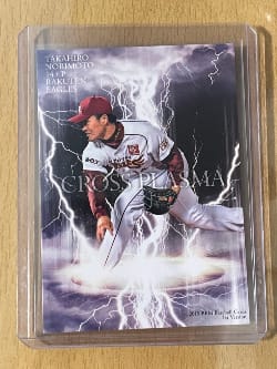
13. Cross Plasma (2015) - 40 OFP
Lightning looks cool! But why not call it Cross Lightning? I understand that lightning is a form of plasma, but did I have to look that up? I’ll give you one guess. The colors make sense with the white/purple/gray/black and a hint of yellow, but it’s another Cross insert that feels a bit one-note. A lack of variation in the color palette can work, but it’s much more difficult and less interesting more often than not, and that’s sort of what I feel here. My eyes are drawn to the lightning bolts, and unfortunately with the majority of the player's hitting/pitching stances, the large central lightning bolt in this design often looks like it’s coming from the player’s crotch. That did not end up being the best design choice in retrospect.
12. Cross Grotto (2022) - 40 OFP
Maybe it’s because I’m a child of the 80’s, but the term “Grotto” has big Hugh Hefner vibes for me personally - literally the first time I ever heard the word was due to that association. This card could use some extra juice that would be found at the legendary Mansion’s grotto. I’m not sure, but it seems like this is an underwater grotto? The background in the cave’s opening has what appear to me to be little air bubbles rising through the water, giving me that underwater feel. If that is the case, a few pops of underwater plant or animal colors would go a long way. I do like the crystalline stalagmites getting the shiny highlights from the spray of light coming from the upper section of the card. Did I have to look up if it was stalagmites or stalactites? I’ll give you one guess.
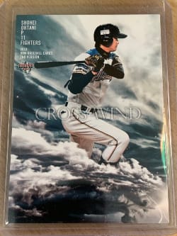
11. Cross Wind (2013) - 45 OFP
This insert gets into the 45 tier because it’s Shohei Ohtani’s rookie year. If not for that, it’s more of a 40 tier in the Cross insert world. It’s mostly a two tone palette with windswept cloudy white/gray design elements mixed with blue-green sky elements. And that’s really it. I would have thought more could be done here, but I’m not really sure what that would be given the place they landed. Maybe a helmet-less Shohei Ohtani with some wind-blown locks? I don’t know, I’m just spitballing over here.
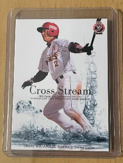
10. Cross Stream (2010) - 50 OFP
From here on out, I am pretty much a big fan of every single Cross insert. This is the OG Cross insert, and it is one of the more minimal designs. I am a fan of white backgrounds like this - it gives everything else on the card the ability to pop. The water droplets and splashes really stand out. The main negative is the two lines of small font product info beneath the Cross Stream text. Without that, I’d be tempted to move this one up the rankings, especially with it being the very first Cross insert.
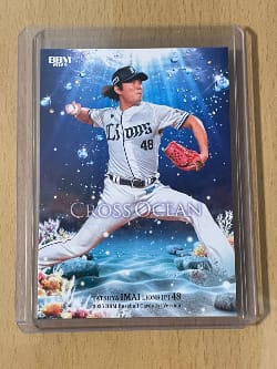
9. Cross Ocean (2025) - 50 OFP
I’ll admit that the newness of this design does some of the work in my rankings. Cross Ocean is the current Cross insert from 2025 BBM products. Blue cards are some of my favorites, and this was an obvious dominant color choice here with it being themed around the Ocean. Just check blue parallel prices that are in higher supply than green parallel prices in lower supply in most products. If you don’t know, even with a higher supply, the blue parallel regular is more expensive than a green parallel. We get a little bit of depth with the floating air bubbles scattered throughout as well as with the aquatic plants and rocks in the bottom left and right corners. The aquatic plants help give some pops of color that are sorely needed - without them, the color palette is just too singular in the blue spectrum. While this might not hold up over the long term, I’m a fan for the moment.
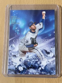
- Cross Freeze (2016) - 50 OFP
Repeating myself a bit with the Cross Ocean parallel here, but I love blue cards. Cross Freeze spans the blue purple white spectrum with frozen water crystals providing forefront depth. In the background we get a subtle but beautiful nighttime sky with white and purple streaking stars look. Constellations and galaxy blur effects put the finishing touches on this card. Is it lacking in variety? Yes. Do I care in this instance? No. Some of the signature versions switch the blue sky for a green sky, and it is a lot less pleasing to the eye. I won't knock it down for that, but BBM got it right with the blue and should have stuck with that across the board.
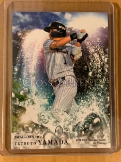
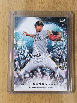
7. Cross Torrent (2021) - 50 OFP
Not many complaints on the Cross Torrent - plenty of colors, light, water, nice balance of elements in the background and foreground. This feels like it would be more apt to call it Cross Waterfall because of the vertical drop of the water on the left side, but that feels a bit nitpicky. The water droplets in the foreground stand out very nicely and really help give the card depth. The white light/sunlight in the upper right give strong light flares off of the water in various spots. At the end of the day, the colors really do all of the work in calling this a strong entry in the Cross series - the blue sky, the roaring rapid whites of the water trailing into various colors of reflected purples, magenta, aqua, and green all work so well.
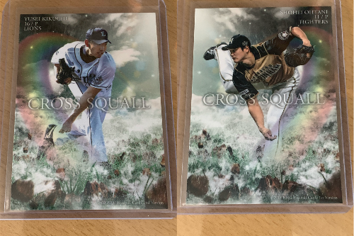
6. Cross Squall (2017) - 55 OFP
A card depicting something of being in the midst of a storm yet having the light and a rainbow break through, signalling a potential end to the squall. It gives me a kick of nostalgia to see this card - that wonder I felt as a kid when I would be astonished that you could see a rainbow in the midst of a storm. Without the rainbow, this card would be much further down the list as it’s basically shades of green and white with some small rocky brown hints of land at the bottom. I’m not sure I’ve seen a rainbow better depicted on a baseball card. I’m a big fan of its transparent nature as well - oftentimes rainbows are shown as the traditional solid arc of colors. This transparency gives it a very realistic feel. It’s also a cool design choice that BBM uses with the player and rainbow always behind them - if they’re facing left in the photo, the rainbow is on the right side of the card, and if they’re facing right, the rainbow is on the left side of the card. Honestly, this card could have been called Cross Rainbow and I would have been even more tempted to move it into my top 5.
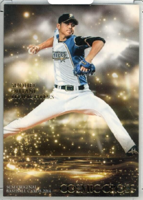
5. Cosmic Cross (2014) - 55 OFP
Similar to the Cross Blast insert, Cosmic Cross was the only other version of this insert that was not part of the BBM Flagship products. And because of that, it’s much harder to come across in North America and there are none in my collection. At least, at the moment - one day I will find a cheap one. And this will be the priority purchase over Cross Blast, the only other Cross insert I don’t have in my collection. As you can tell by the ranking, I have this much higher, so the priority is obvious. To me, this is the Austin Powers Goldmember meme come to life - this is all about the gold. There’s definitely a strong Hobby correlation here as well, as the Hobby highly values gold parallels. The card is essentially a lake of gold beneath the player highlighted by gold water droplets splashed all over the card. A dark clouds theme with sunlight shining through in the background gives more life to the card, but it does feel a bit one note. In this case, with that note being gold, I don’t knock it down for that. A couple more quirks to note is that the insert name, Cosmic Cross, is in the bottom corner of the card and is in gold lettering. This positioning is a departure from the rest of the insert set across the years, just like the flipped name. Similarly, the player and team info is in gold lettering. Depending on the angle, it’s easy to lose that in the card. And I have to mention - I'm not really sure what the "Cosmic" element here is other than maybe the background is some sort of cosmos representation. Anyways, this is such a cool card in my opinion, and a small but fun departure from the majority of the set through the years, that I think it deserves a high ranking, which is why I have it in my top 5.
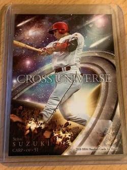
4. Cross Universe (2018) - 60 OFP
The first of three space/astronomy style Cross inserts that I find more attractive than what we've seen from the wildly popular Topps Cosmic Chrome, Cross Universe. Cross Universe gives us “shooting stars”, planets, galaxies, and a huge “rings of Saturn” style theme, all in one card. My only minor complaint is in the bottom left corner where the player’s plant foot lands - it’s sort of a cool planet smashing force plate explosion scenario. The complaint is that it’s too dull brown and it takes up a fair bit of space in the lower left corner. If they figured out a better approach there, perhaps even just making it smaller, I would have been tempted to move it even higher in the rankings.
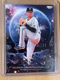
3. Cross Earth (2024) - 60 OFP
Talk about super cool cards! Seriously, put this next to a Topps Cosmic Chrome Planetary Pursuit Earth card - the Topps version feels like a high school photoshop project while the BBM Cross Earth feels much more realistic and professionally done. While I could go into minute details on the comparisons, I’ll just leave that and focus on the BBM version. The blending of the galaxy and the Earth colors work so well together. The Earth’s border being that sun touched blue white is a beautiful touch. I do enjoy the idea they are playing with here, that you are seeing the Earth from the Moon. I do wish it was more like 20% of the card rather than the 30%+ of the card it takes up, but I can easily ignore it. Overall it’s a great looking card and it was a tough call on where in my Top 5 this would fit, but I couldn’t get it higher than 3rd position.
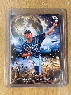
2. Cross Moon (2023) - 70 OFP
There’s not much separating the Cross Earth and Cross Moon inserts in my rankings. Cross Moon gets the edge mostly because it’s a brighter card that allows it to pop more. The forest tree line in shadows highlighted by multi-colored spheres (water drops I assume) is a really smart way to break up the horizon line, and it carries over into the water reflection beneath it. Yellow and blue is also a classic color combination - with this being more golden yellow and the blues flowing into the purple of the night, the palette just works. The moon being offset is another great choice - unlike Cross Earth with the planet centered behind the player. It is more aesthetically pleasing and better showcasing the theme. As I said with the Cross Earth and Cross Universe commentary, if you enjoy Topps Cosmic Chrome, and even more, the Planetary Pursuit insert, these are just such better looking versions of that.
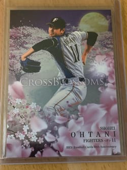
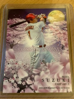
1. Cross Blossoms (2020) - 80 OFP
Cross Blossoms was the first time I became aware of the Cross inserts. I was immediately “in”. This is easily the best in the series over the years. If you think otherwise, you’re objectively wrong. That’s a bit of hyperbole, and I respect NPB Card Guy’s opinion that he’s tired of it at this point. If I was collecting BBM cards since 2010 and seeing these inserts year after year, I can see where he’s coming from. But as a gaijin who started collecting BBM cards in 2020 primarily because of the Cross Blossoms insert, there’s not another insert card year after year that I look forward to more. The cherry blossom theme in general is almost always a winner, from the Washington Nationals City Connect uniforms to the Topps Japan Flagship parallels. Cross Blossoms, however, is easily the best when it comes to seeing the cherry blossoms done on a card. I don't even know what to say other than take a look at the card and tell me I'm wrong (I'm not). This is the cream of the crop, the elite, the number 1 Cross insert and I don't think it will ever be topped.
That’s my Trading Card Story this time around - my favorite insert, and not one most people would expect it to be, or possibly have ever heard of.
A massive hat tip to NPB Card Guy - his blog is almost always my primary reference for anything NPB cards, including his article on BBM Cross inserts where I sourced a fair amount of the background info. Go follow him if you have any interest whatsoever in Japanese baseball cards.


Discussion